Super-primitives in design systems
A design-system note about the layer underneath components: the tokens, primitives, defaults, and naming decisions that decide whether a system scales or becomes a catalogue of exceptions.
A practical design-system argument: get the primitive layer right and the rest of the library becomes easier to govern.
Hey there, so I am guilty of overusing Primitives in my design systems. Primitives are super-components — component patterns that can be reused inside other components. I call mine the <SuperPrimitive>.
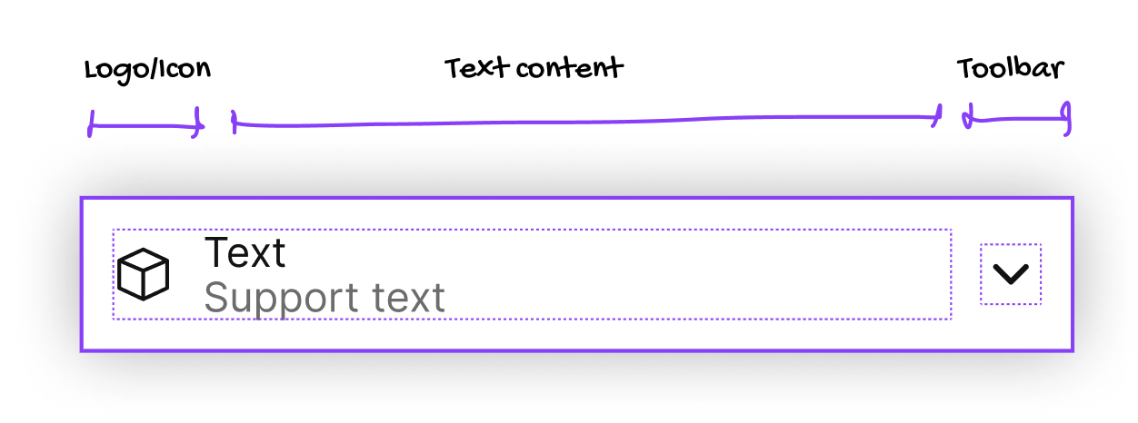
My <SuperPrimitive> Figma component — It's the Swiss army knife of components: this one can cover 80% of your atomic component needs. With a few choice props it can form many, many atomic components. It's like a lever, pointing to the moon.
The left-side contains icon plus texts, and the toolbar on the right contains a stack for general use (generally icons), but it can be switched to any other component you might need.
Props
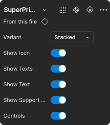
I use six props:
- Stacked or inline
- Show/Hide Icon left
- Show or hide all the texts
- Show/Hide the Primary text
- Show/Hide the Support Text (second line)
- Show/Hide the Controls (an icon stack)
With the SuperPrimitive I can cover 80% of my atomic component needs by creating a component from this primitive, styling it and changing the primitive props.

The beauty (and the danger) of this is that I can easily update ALL the components that use the primitive across the board: update the padding, add features, remove them — and all the children of this primitive will be updated.
The danger is that some updates to the primitive will upend the overrides in the children. So we need to be careful.
“With great power comes great responsibility.”

Swap the icon left for a logo; add more icons to the toolbar right-side; apply styling and away you go.
Get started
Jump into my YouTube tutorial to get started — it's part of my Design Systems in Figma course.