Work · 41 items
Work examples.
Projects, case studies, and employer arcs. Filter by type or discipline, or open any card for an introduction and overview.

CloudBees
Six years growing a design function from 3 to 9. Led platform UX unification across five product lines — turning a fragmented DevOps suite into one coherent experience. Delivered HoneyUI design system and the company's first AI dashboard.
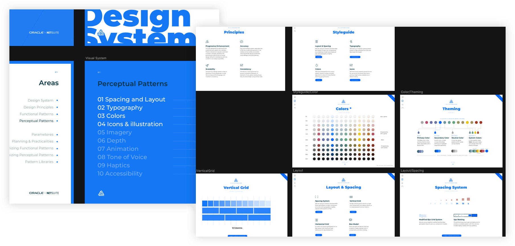
Monospace Design System — AI-native UI system
Most design systems start in Figma — tokens in a shared library, components in a published file, handed to engineering as an interpretation. The code always comes second, a loose reading of whatever the design file intended. For SaaS and AI-native products that ship fast, the gap between the documented system and the running product is where consistency quietly leaks away.

Oracle Netsuite
NetSuite already had a design system — fifty product teams just weren't using it, each designing in isolation. I led a four-person team to change that: a sprint-validated documentation site and component library, and an incremental refresh that earned adoption team by team, starting with Analytics — without breaking the products built on the old one.
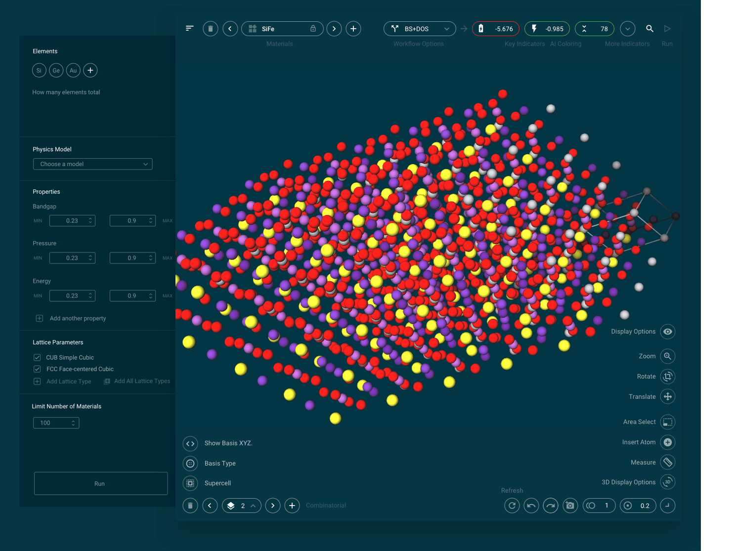
Exabyte / Mat3ra
Solo design lead in a 4-person startup, I reframed Exabyte from a single tool into a platform onboarding organizations and universities — fixing the IA, moving to a Google-system foundation, and giving scientists a UI that matched the way they actually worked.
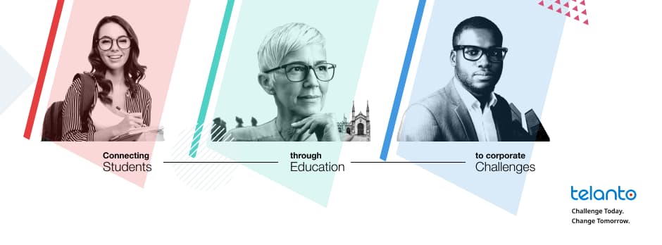
Telanto
Telanto's brand was undefined where it touched product, and a complex business model leaned on the marketing site to explain itself. As a team of two I brought content, brand, design system and the full marketing site under one author — giving Telanto a coherent language across product and market that normally takes a team of five to seven.

Honey UI — CloudBees Design System
CloudBees ran multiple product surfaces under separate teams — CloudBees CI, CD/RO, and Feature Management — each building UI components independently. Compounding inconsistency, duplicated work, and the absence of shared design tooling slowed every team down and made the platform feel incoherent to users navigating across products.

Unify — SaaS Platform Design
Taking on the Head of Design role brought a step-change in scope: inheriting a team of six designers across multiple product lines and stepping into a mission that reached well beyond any individual surface. Unify was CloudBees’ programme to consolidate the full product portfolio onto a single, shared SaaS platform. That meant designing for a product that didn’t exist yet, coordinating a distributed team across it, and simultaneously building the foundational infrastructure — navigation model, UI patterns, design system — that everything else would depend on.

AI Week
The AI landscape moved faster than product roadmaps in 2023. Rather than wait for formal roadmap approval, CloudBees ran an internal AI Week — a focused sprint where product teams could prototype AI-native features quickly and cheaply. For CDRO and the emerging Unify platform, two threads emerged: an AI chatbot for reporting and dashboard queries, and an AI-assisted pipeline creation system.

Research Operations
Research at CloudBees was project-by-project — no shared process, no tooling, no taxonomy. Insights were siloed, duplicate work was common, and there was no institutional memory across a growing design team.

Core Navigation & Product Switcher
CloudBees had grown into a multi-product platform but the navigation header still reflected a single-product era — users who entered via CI had no clear path to discover or switch to Analytics or CD.

CDRO — CD Release Orchestration Redesign
The CDRO product — CloudBees' CD Release Orchestration — was built for pipeline configuration experts. When the Honey UI design system team was disbanded and the platform pivoted to Google Material Design and MUI, the team structure changed: three designers moved into a CDRO-focused team with me stepping into a management role. The mandate was a next-generation redesign — not a facelift, but a ground-up rethink of how CDRO should work for a broader engineering audience. Over the following months the team ran the full double diamond: discovery through delivery, across the core CDRO UI, a new dashboard layer, a manual approvals widget, and YAML configuration surfaces.

Product-Led Interface — Navigation as Onboarding
The SDA platform's global header held four disconnected affordances — search, notifications, help, and profile — each built independently with no shared language. New users had no in-product guidance and help lived outside the product, driving context switching and slowing onboarding.

SDA Analytics — Plugin Usage Analyzer
Enterprise teams running CloudBees CI at scale had no visibility into plugin health across their controller fleet — which plugins were unsupported, outdated, or actively in use across pipelines — making upgrade planning and compliance audits entirely manual.
Codeship
A challenge set by CloudBees — redesign the Codeship build funnel from first visit through to a first build triggering. I started with a current-state critique: the landing copy, fold position, and signup flow all had friction points. Then redesigned across four surfaces: a cleaner landing page, a single-page quick-start wizard (account → project → build settings → go), a post-setup projects dashboard, and the watching-for-first-build state. The exercise became the door into six years at CloudBees.

CI/CD User Journey Mapping
The CloudBees platform redesign had no shared evidence base — prioritisation was running on assumptions, not on what field sales, customer success, and customers were actually experiencing.

Build Notification Plugins
CloudBees CI ran Jenkins for most of the enterprise customer base, but developers lived in Slack and Teams — build feedback required navigating to a separate tool, outside the daily workflow.

CI Plugin Marketplace
Jenkins' built-in plugin manager is a flat list inside the central settings page — no hierarchy between plugin types, no distinction between CloudBees proprietary and community plugins, and no context to help users understand what a plugin does before installing it.

CDRO — Platform Port to Unify
CloudBees was beginning its Unify initiative — a strategic move to consolidate the full product portfolio onto a single, shared SaaS platform. Every product team faced the same question: how does what we’ve built fit into the new shell? For CDRO, with its pipeline hierarchy, org model, and navigation conventions developed over years as a standalone product, the fit wasn’t obvious. This was early work — before any formal specification or engineering commitment — sketching out whether and how CDRO’s concepts could map onto the Unify platform.

IESE Business School
IESE's I3L programme had a clear vision for personalised executive learning but no tested product model. As solo designer I ran the strategy workshops, mapped the full IA, and delivered two working prototypes — giving the team a validated, buildable foundation to take into development.

Bikesoup
Bikesoup needed buyers to research, compare and buy confidently across mobile, tablet and desktop, so I led the UX end to end: research, IA, responsive flows, wireframes and shipped product. It won a Behance UI Award in 2013 — early enough that the wireframing thinking itself was the prize.

Hugo Boss · Esprit · via Machinas (agency)
Two global fashion brands needed their identity to hold together across every digital surface, not just the lookbook. Through Machinas I art-directed and translated Hugo Boss's and Esprit's brand language into UX structure — campaign pages, seasonal newsletters, help flows, even an Apple Watch storefront companion — so each surface felt brand-coherent and the patterns were reusable. The case that grew an Art Director into a UX Lead.

Life! Agency
Art direction and visual web work for Italian and international clients — food heritage brands, restaurant chains, a dyslexia charity, and a gaming ecommerce platform.

xtralife
xtralife is a gaming ecommerce platform — the storefront where players browse, configure, and buy in-game items and bundles, plus a companion mobile flow for the same catalogue on the go. Direct freelance engagement: end-to-end product design across desktop and mobile, with the brand identity, the storefront UX, and the visual system held together under one hand.
Doghero
Doghero is the São Paulo–born marketplace that connects dog owners with vetted hosts and sitters across Brazil — daycare, boarding, and walks, booked the way you'd book a room. The site has to do two unrelated jobs cleanly: convert anxious owners who are leaving their dog with a stranger for the first time, and recruit sitters who'll stake their weekends on the platform. Both audiences land on the same homepage.
InEdicola
InEdicola was the digital-newsstand pitch for Gruppo Monrif — the Bologna-based publisher behind Il Resto del Carlino, La Nazione, and Il Giorno, the regional dailies that anchor northern and central Italy. The brief: stop selling single PDFs, start running a real subscription product where readers can buy, browse, and read the day's editions across desktop and mobile. Direct freelance engagement with the client, no agency in the middle.
Carro.me
Carro.me was a peer-to-peer car sales marketplace — designed to take the dealer out of the middle and let private buyers and sellers find each other, negotiate, and close, all in one place. The product had to handle the awkward parts of a private car sale (shortlisting, making and counter-making offers, scheduling viewings, building enough trust to hand over keys to a stranger) without feeling like Craigslist with paint. Direct freelance engagement, end-to-end product design across desktop, mobile, and the transactional emails.
L3
L3 — Life, Longari & Loman — was the agency's in-house communication management system: a proprietary CMS used internally to run client websites, ecommerce stores, and marketing content across the Life! roster. One product, many tenants. The interface had to read as professional tooling for editors who'd live in it eight hours a day, while staying flexible enough to power radically different front-ends — flour mills, coffee roasters, restaurant chains, dyslexia non-profits — without a separate build each time.
AID
AID — Associazione Italiana Dislessia — is the national non-profit that supports people with dyslexia and other specific learning differences across Italy: a network of 100+ local chapters, parents, teachers, and clinicians. We designed their mobile app — built so the people who need it most (often dyslexic readers themselves) can navigate it without effort. Accessibility, legibility, and tone weren't add-ons; they were the brief.

Technogym
Technogym is the Cesena-based wellness company founded by Nerio Alessandri in 1983 — the equipment behind the world's high-end gyms, hotels, and most of the recent Olympic Games. The work spanned the digital surfaces of the Club 4.0 era: a darker, editorial-led visual language for membership and content, plus a lighter system for product and class browsing. One brand, two registers, held together by typography and grid.
Caffitaly
Caffitaly is the Bologna-based capsule coffee system that powers a network of branded boutiques and home machines across Italy and Europe. The work covered two surfaces: the desktop site that doubled as the shop and the dealer-facing world, and the companion mobile app for owners of the home machine — onboarding, capsule re-ordering, and machine care.

Life!
The second redesign of the agency's own website — this time after the firm shed the LLL initials and rebranded as 'Life!'. Bigger type, more confident editorial pacing, and a clearer path through what the agency does: Home, Work, Servizi, Careers. Same client as the first redesign, just three years older and more comfortable being seen.
Roadhouse
Roadhouse is the American-themed steakhouse chain run by Cremonini Group — the largest casual-dining operator in Italy, with around 150 restaurants from Milan to the south. The site sits between brand storytelling and operational utility: it has to look like the room (warm, smoky, neon-lit) while letting people find their nearest restaurant, see the menu, and book a table without friction.
Sojasun
Sojasun is the French-born plant-based food brand — soya milks, desserts, and ready meals — distributed across Italy and southern Europe by Cooperlat. The Italian site had to do two things at once: sell the everyday products to mainstream supermarket shoppers, and tell the recipe-led, lifestyle story that pulls plant-based curious eaters into the brand.
Essse Caffè
Essse Caffè is the Bologna-based espresso roaster founded in 1979 — a third-generation family company that supplies bars, restaurants, and offices across Italy and exports to more than 50 countries, and that runs its own coffee-and-entrepreneurship academy. The site had to honour the heritage roaster story, sell the bean and the cup, and give the academy room to recruit — all responsively, on a single editorial spine.
Calavera
Calavera is an Italian restaurant trading on a Day-of-the-Dead, Mexican-inflected visual language — bold, graphic, and a long way from the trattoria template. The site had to read at a glance as a place worth booking on a Friday night, and hold up as the brand's main shop window for menu, location, and reservations.
Molino Spadoni
Molino Spadoni is the Romagna-based flour mill founded in 1921 — a fourth-generation family business that grew from a single mill into a national supplier of speciality flours, gluten-free ranges, and ready mixes sold to home bakers, pizzerias, and supermarkets across Italy. The site had to honour a hundred-year heritage while running as a working ecommerce — homepage, shop, product detail, cart and checkout — without making the brand feel either dusty or generic.

Giuso
Giuso is the Asti-based ingredient maker founded in 1919 — a hundred-year-old supplier of pastes, syrups, and toppings for gelato shops and pastry kitchens across Europe. Same shelf as MEC3, different temperament: a quieter, more provincial brand that sells on craft and longevity. The site had to wear that hundred-year heritage without slipping into nostalgia.

Pernigotti
Pernigotti is the Novi Ligure chocolatier founded in 1860 — the gianduja, the cremino, the chocolate eggs that turn up in every Italian household at Easter. The site had to honour 160 years of confectionery heritage and sell the everyday product, on desktop and on mobile, without burying either job under the other.
MEC3
MEC3 is one of Italy's largest manufacturers of ingredients for artisan gelato and pastry — pastes, variegates, and toppings sold to thousands of independent gelaterie across Europe. The brand sits in a category where the buyer is a craftsperson, not a consumer, so the visual language has to read as both industrial-grade and trustworthy on the lab bench.
Bahlsen
Bahlsen is the Hanover-based biscuit company founded in 1889 — the family business behind Leibniz, Choco Leibniz, and the bulk of the gold-foil tin you grew up seeing on the supermarket shelf at Christmas. The Italian site had to honour 130 years of brand equity (the typography, the gold, the German precision) while behaving like a modern editorial product catalogue rather than a corporate brochure.
Life, Longari & Loman
LLL — Life, Longari & Loman — was the original name of the Bologna agency I spent time inside as Art Director. This was the first of two website redesigns I led for the agency itself: an editorial site that told the firm's brand-story through the work, with a long-scroll case-study spine that doubled as the new business pitch. (The same agency rebranded later to 'Life!' — see the second redesign for that chapter.)
41 of 41 items
Recent work demos · 8 videos