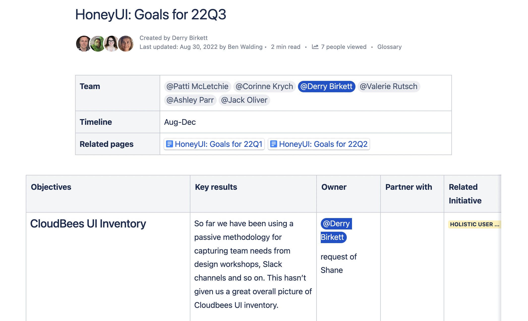
CloudBees ran multiple product surfaces under separate teams — CloudBees CI, CD/RO, and Feature Management — each building UI components independently. Compounding inconsistency, duplicated work, and the absence of shared design tooling slowed every team down and made the platform feel incoherent to users navigating across products.
Solution
Honey UI: a shared design system for the full CloudBees platform. Built on a dynamic color architecture supporting multi-product theming, Honey shipped a component library (v3) covering all core interaction patterns, a wireframe kit for design-phase use, and structured documentation. Adoption was tracked across product teams; Plugin Manager was rebuilt on Honey as the first large-scale proof point.
Consistency as infrastructure, not constraint
01 Goals & Vision
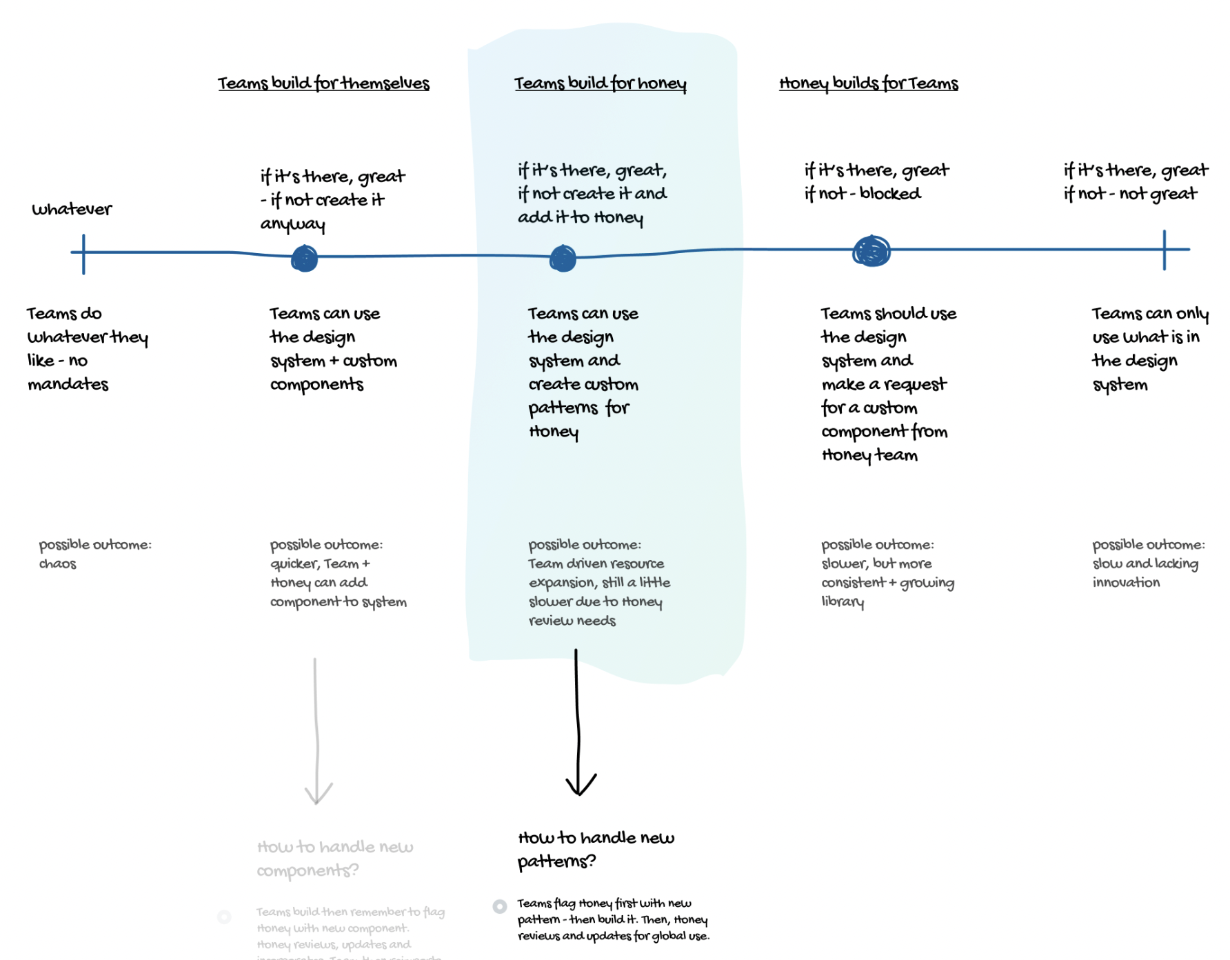
CloudBees had multiple product surfaces — CloudBees CI (enterprise Jenkins), CD/RO (release orchestration), and Feature Management — each evolving under separate teams and shipping UI components from scratch. The result was compounding visual inconsistency, duplicated engineering effort, and slow design cycles. Honey was the attempt to resolve the central tension in any design system: how do you deliver platform-wide consistency without removing the autonomy each product team needs to move quickly?
001002003
A color architecture built for a multi-product platform
02 Dynamic Color & Theming
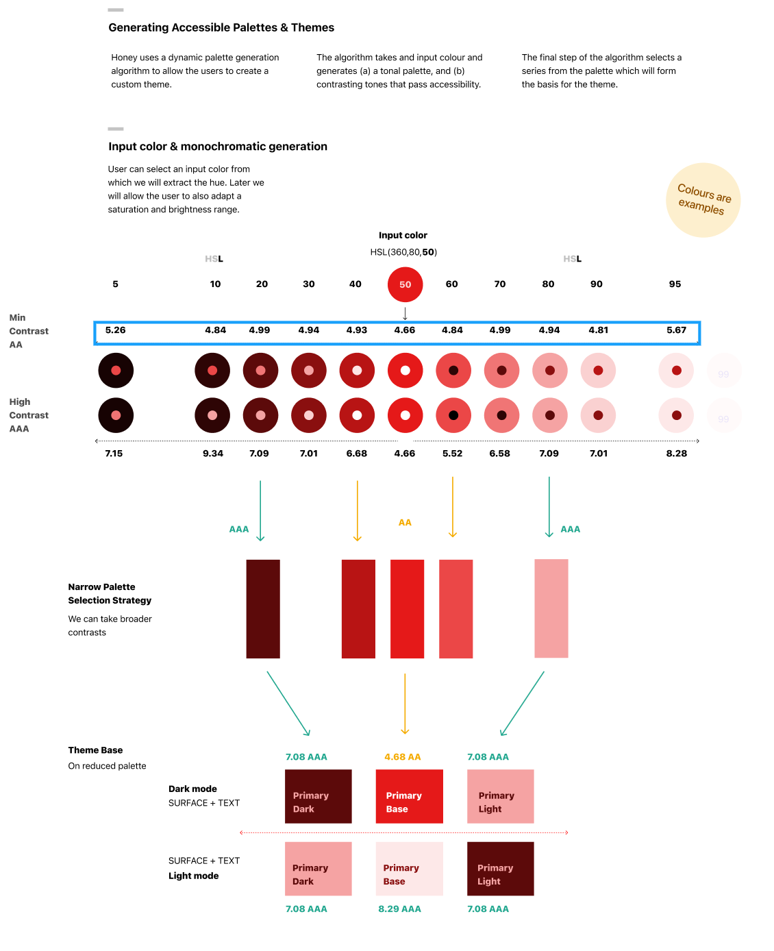
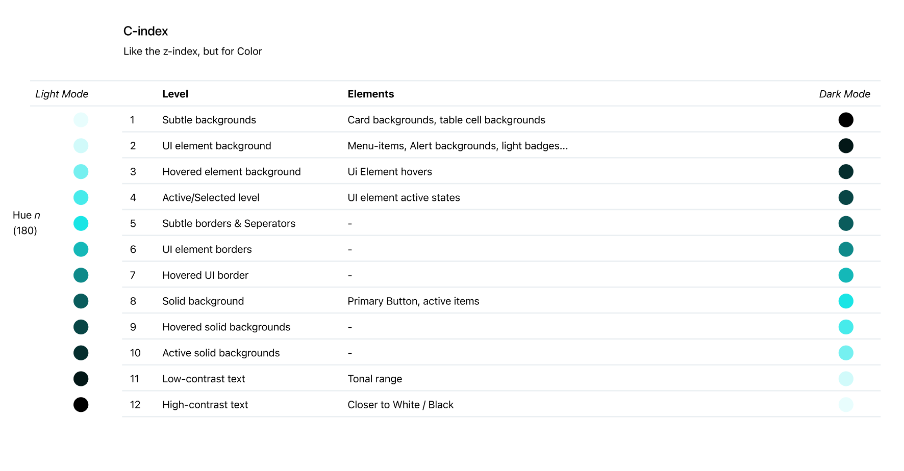
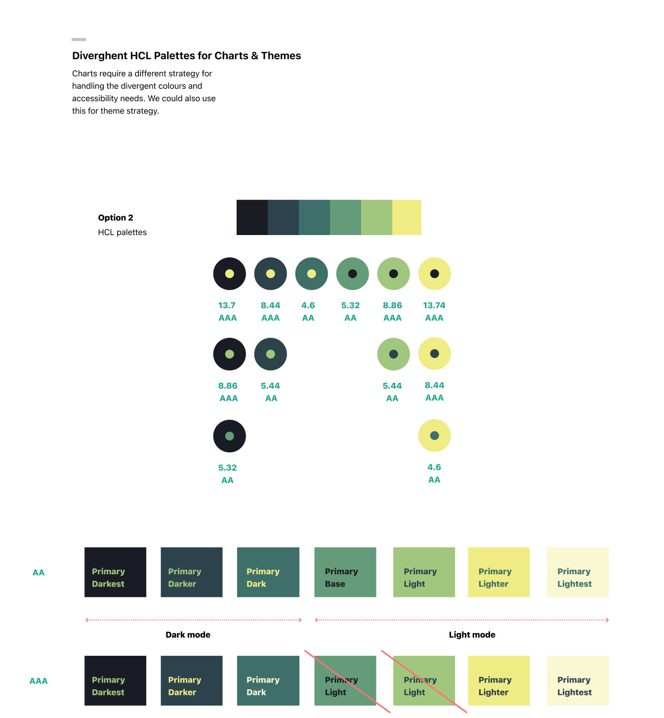
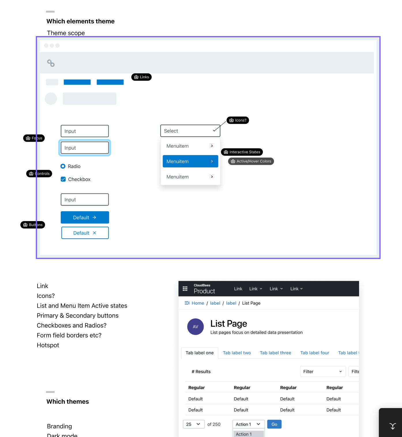
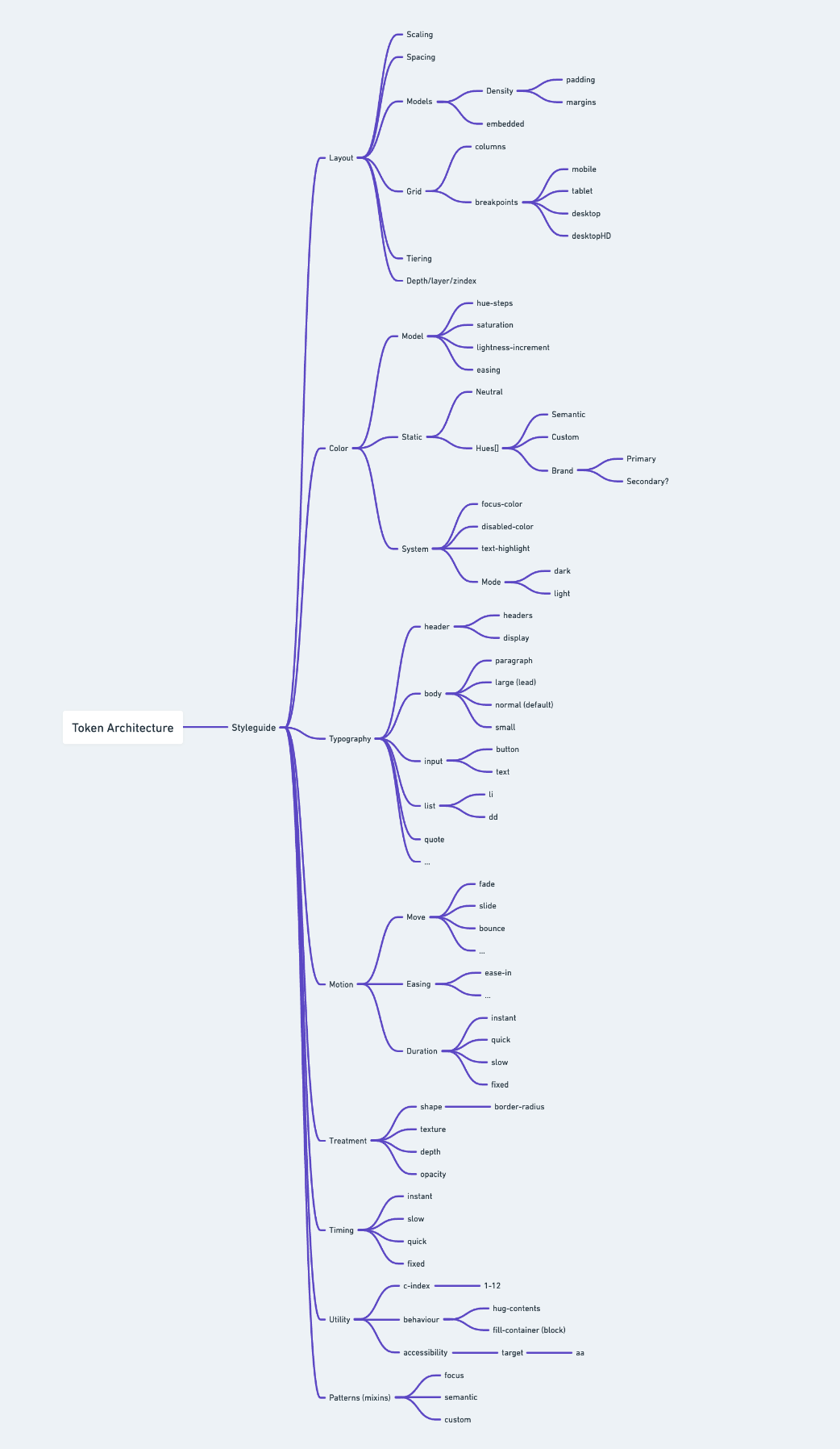
The foundation of Honey was a dynamic color system — semantic color tokens that could be resolved at the product level, enabling each surface to carry its own brand expression while sharing a common token language. This made theming a first-class concern rather than a retrofit, and allowed the platform to evolve without visual divergence.
004005006007
Modular components built for enterprise-scale UI
03 Component Library
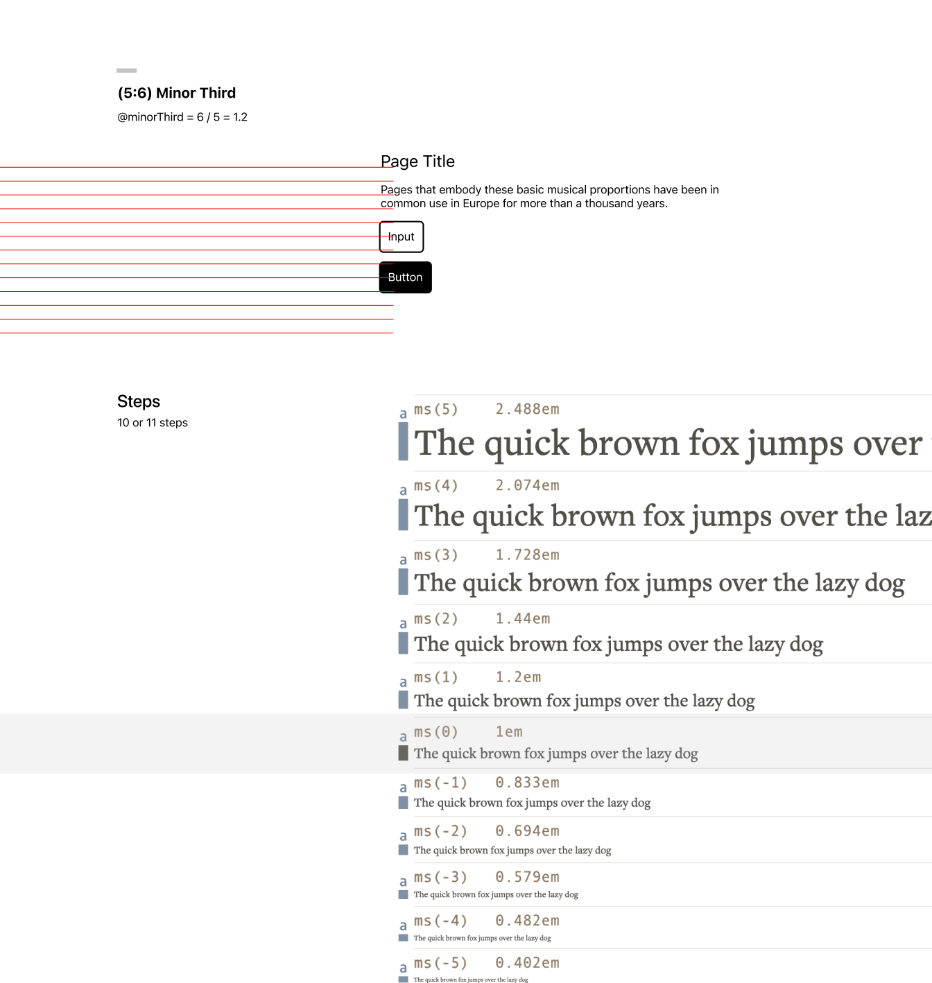
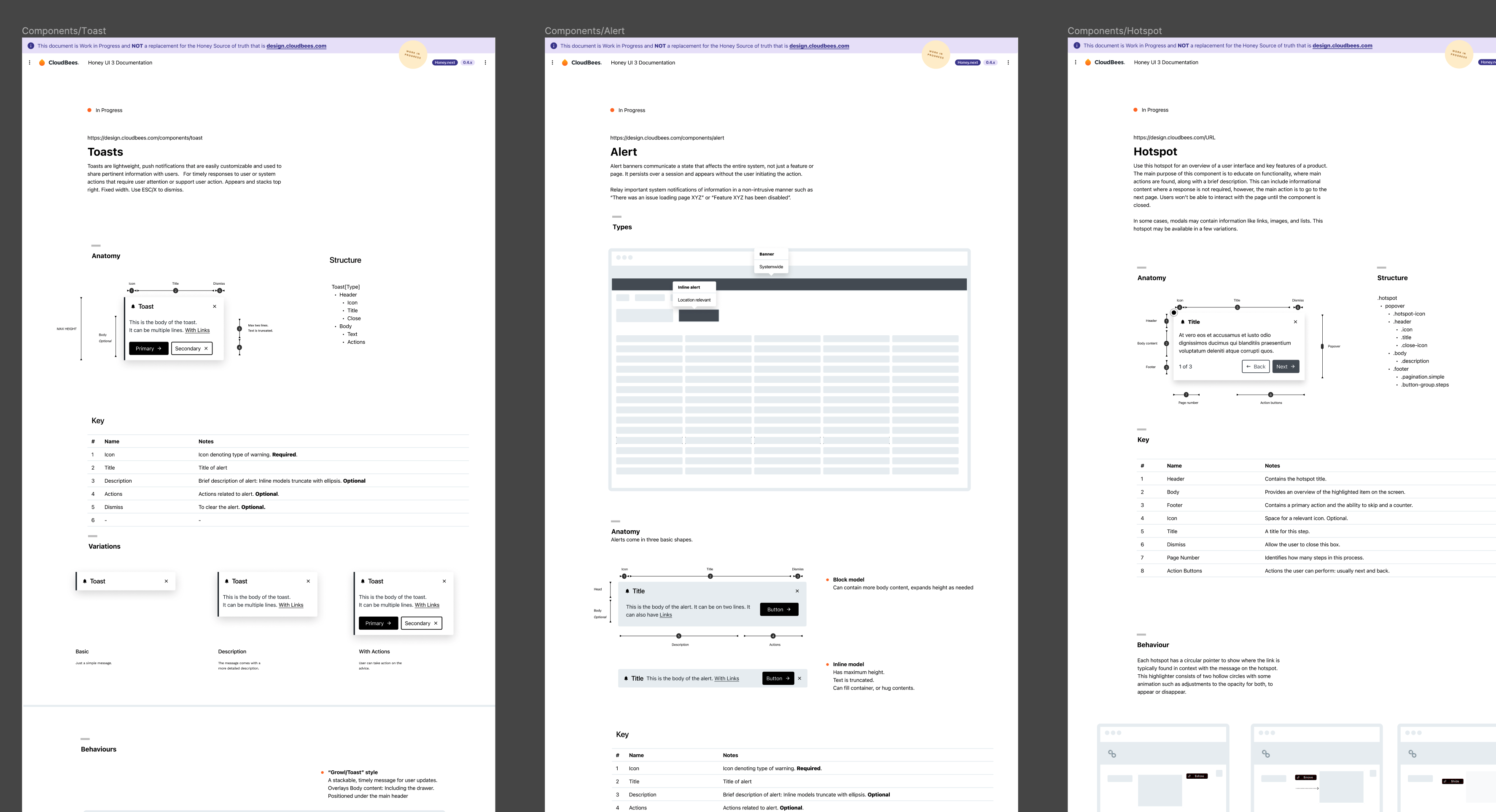
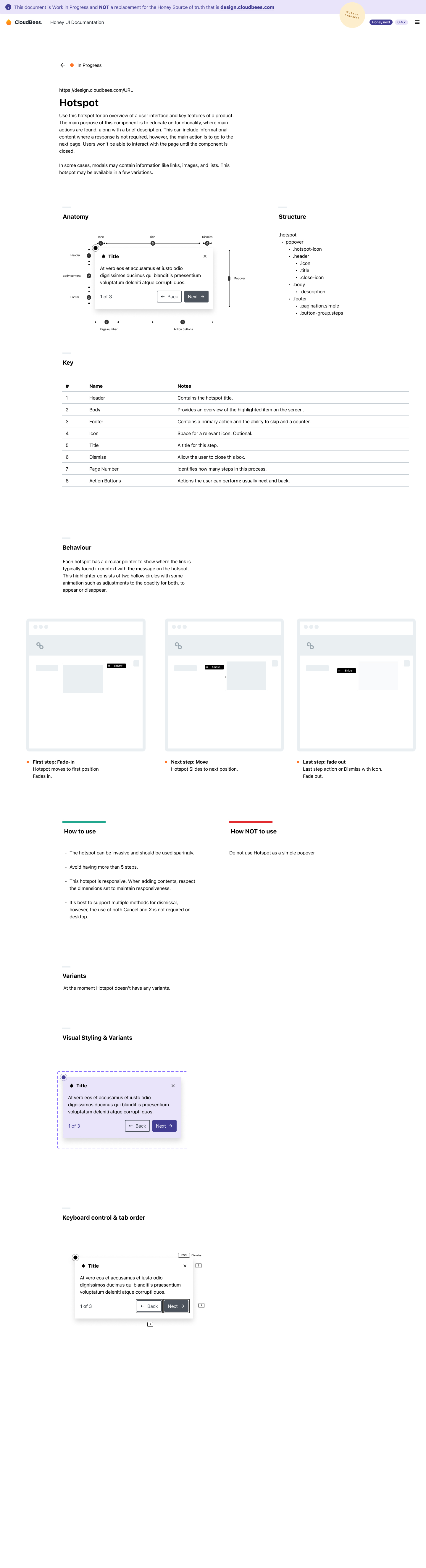
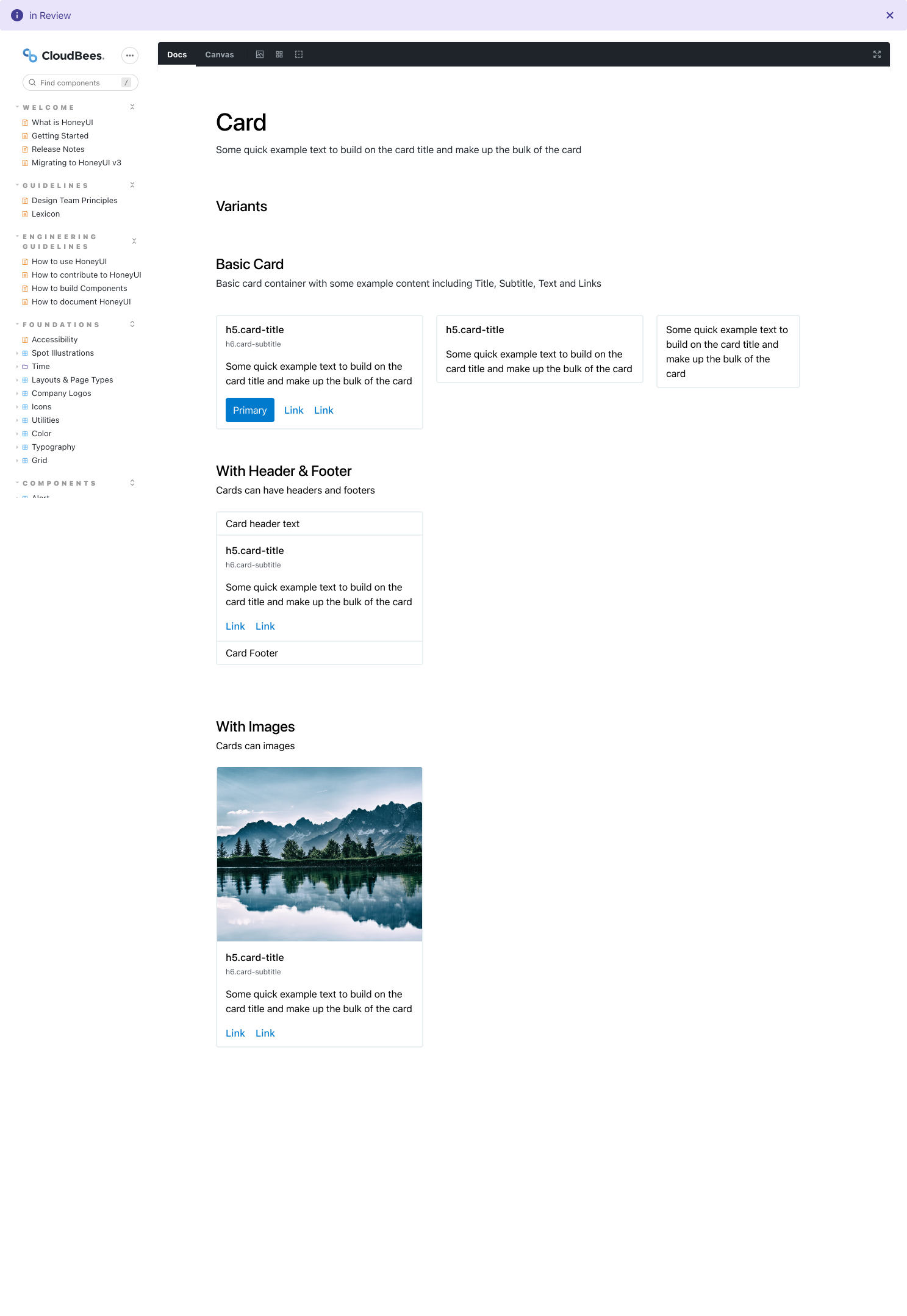
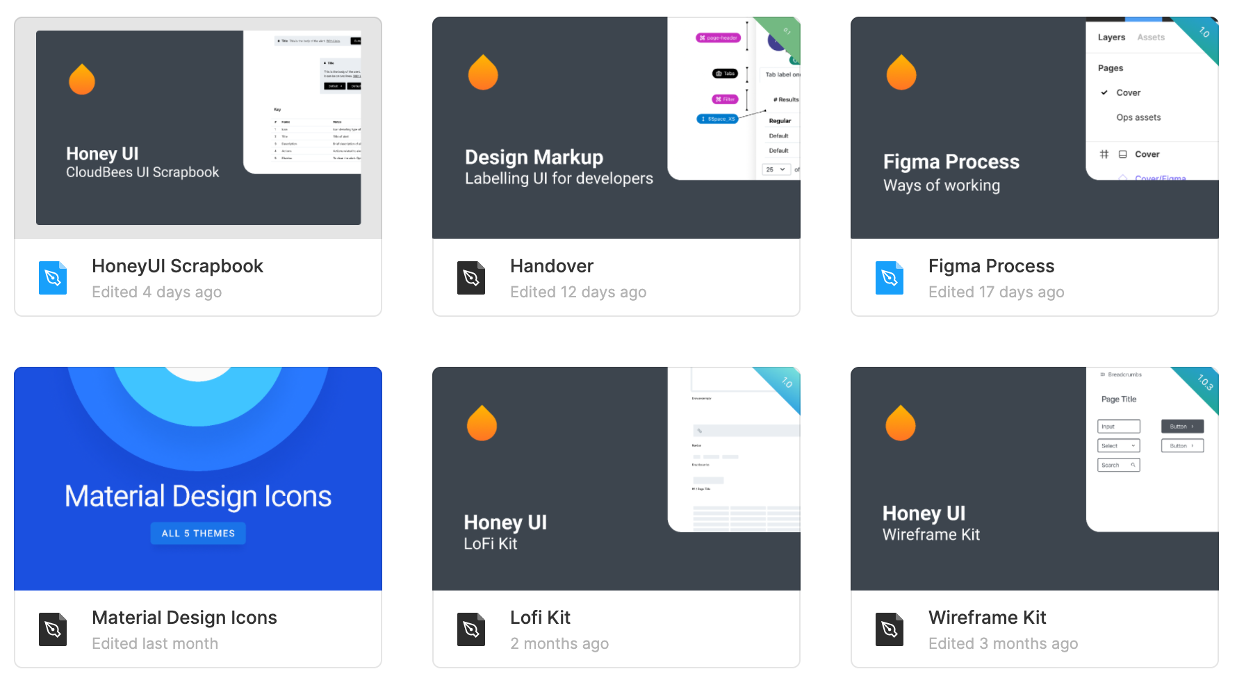
Honey v3 shipped a full component library covering the interaction patterns common across all CloudBees surfaces. Each component was documented with a spec sheet, usage guidelines, and design tokens. The modular scaling system tied type, spacing, and component sizing to a shared grid, ensuring visual coherence across product boundaries without enforcing pixel-level uniformity.
008009010011012013
From system to product — Honey in production
04 Adoption & Impact
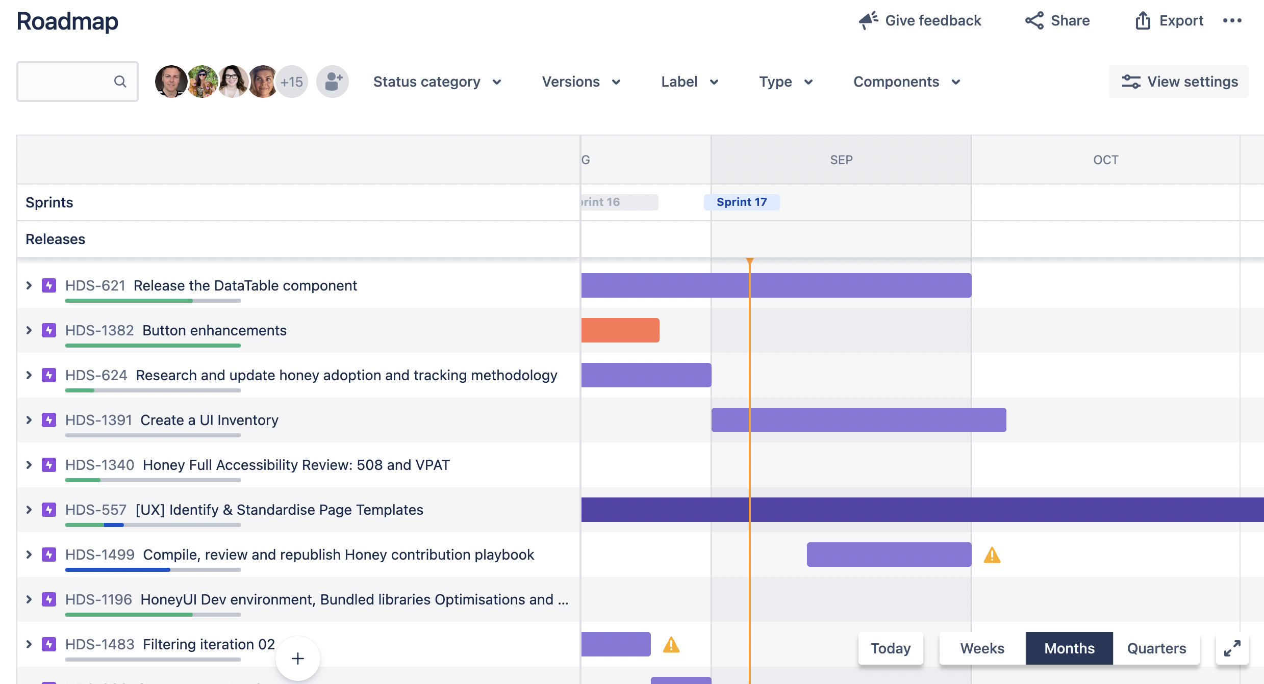
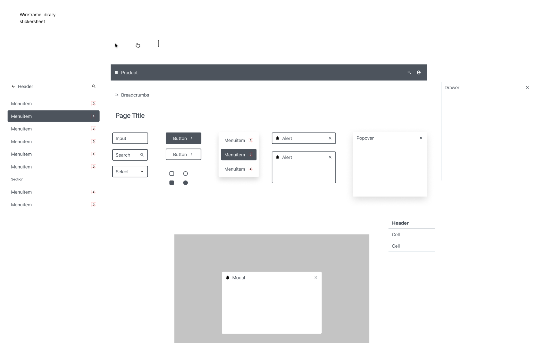
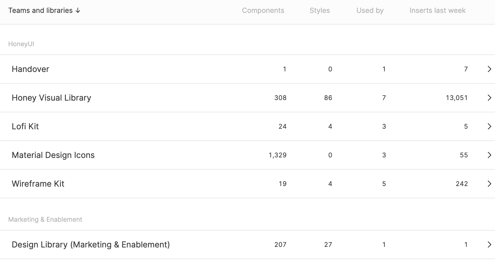
Adoption required more than a component library — it needed design tooling that met teams where they worked. The Honey wireframe kit let designers prototype at speed using shared components before switching to high-fidelity. Usage tracking across product squads confirmed that Honey components were live across CI, CD/RO, and Feature Management. Plugin Manager — a complex, high-traffic enterprise surface — was one of the first proof points: rebuilt end-to-end on Honey with a prototype used to align engineering and product before implementation began.
014015016
A concept for where the design system could go next
05 Wax — Next Generation
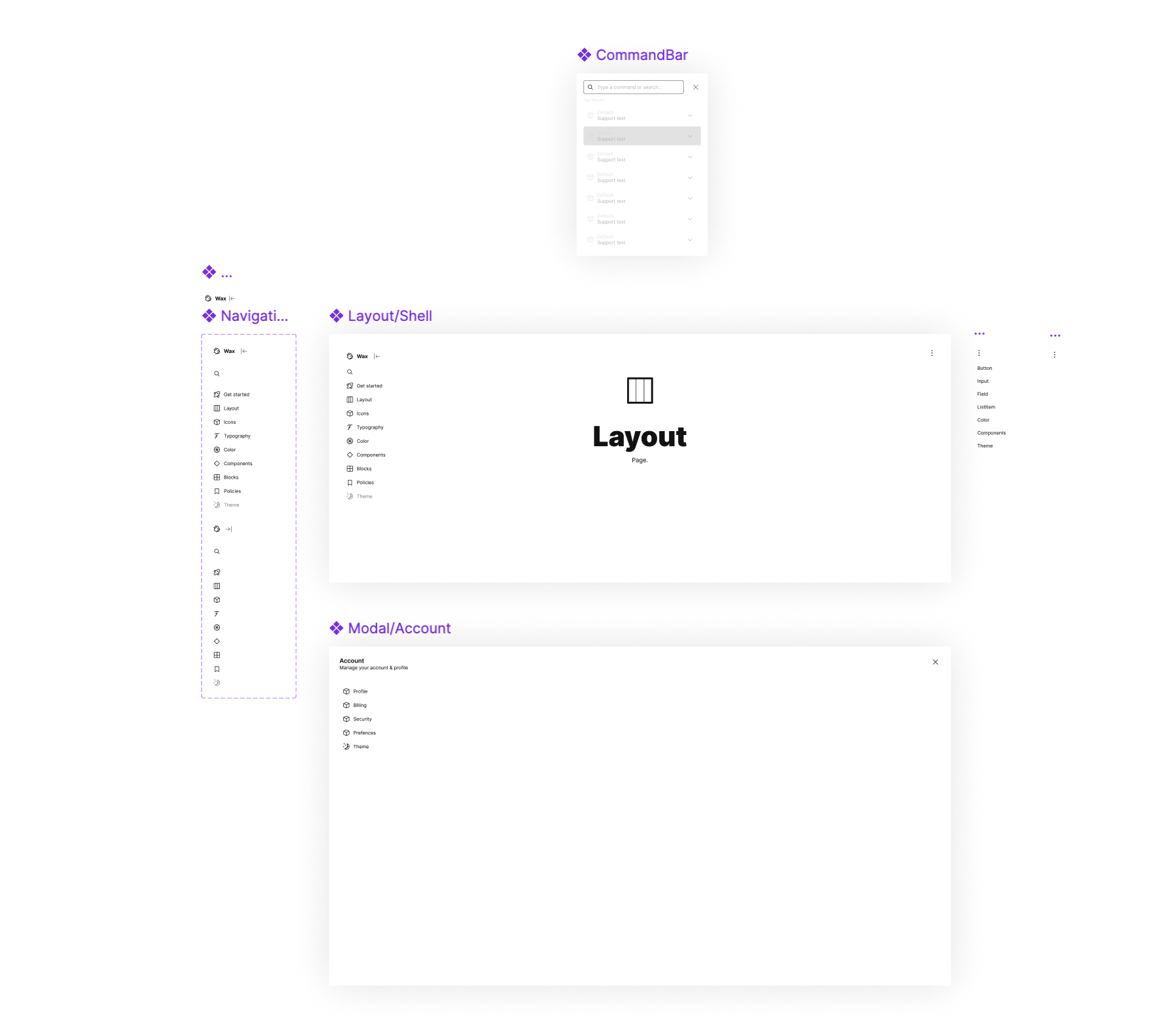
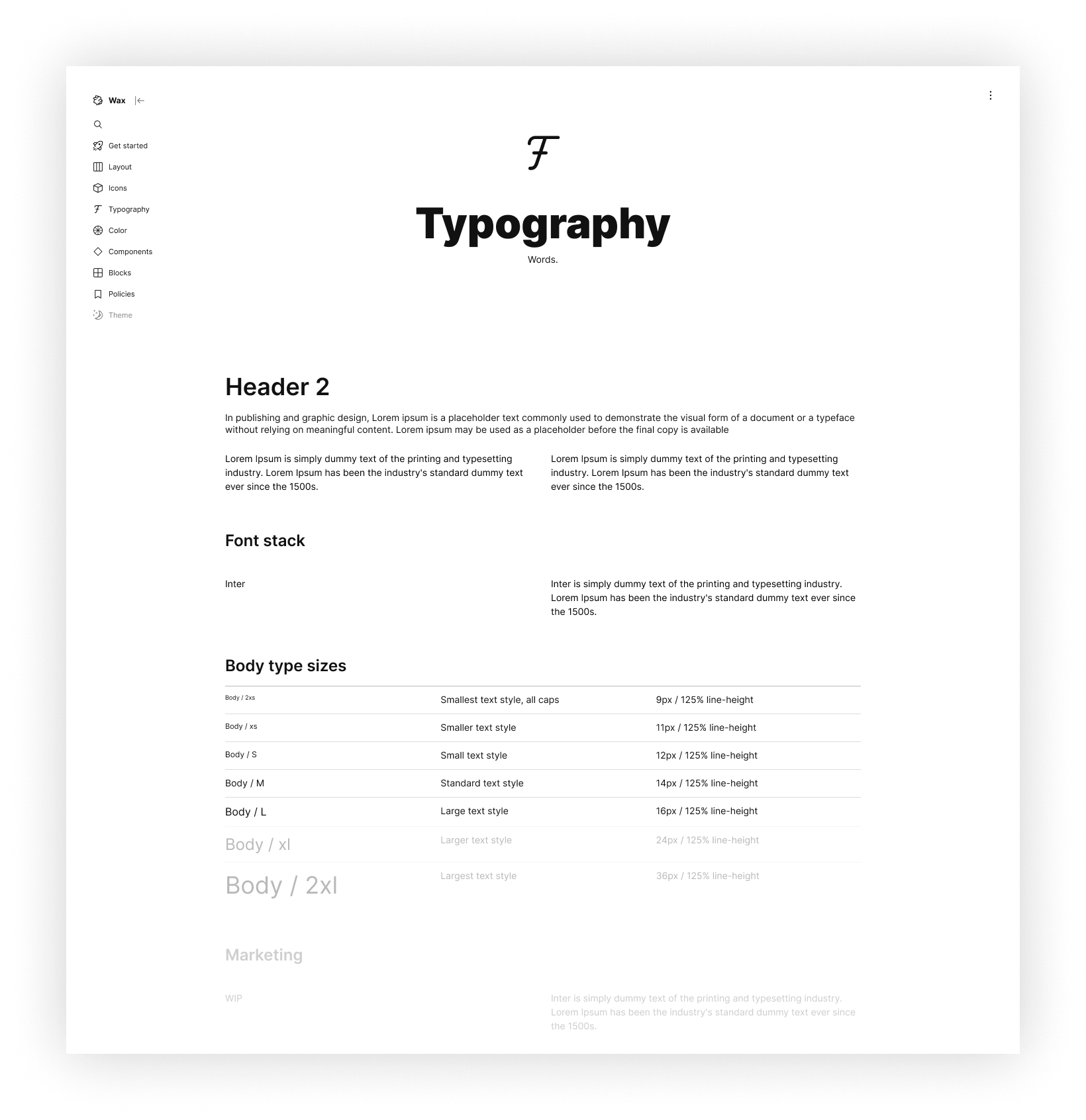
Honey was the production design system. Wax was a forward-looking prototype exploring the next layer of the architecture — a block-based composition model built on Honey's token foundation. Where Honey standardised components and their usage rules, Wax explored how those same tokens could underpin a more modular, assembly-first approach: layout primitives and typographic rails that product teams could compose into surfaces rather than selecting from a fixed component menu. The concept didn't ship — it was a design-led provocation about what a second-generation system might look like as the platform matured.