Product design — PLI system concept, IA, and wireframes for the SaaS Foundation team
Role: Senior Designer
product-designux-research
Problem
The SDA platform's global header held four disconnected affordances — search, notifications, help, and profile — each built independently with no shared language. New users had no in-product guidance and help lived outside the product, driving context switching and slowing onboarding.
Solution
Defined a Product-Led Interface initiative for the SaaS Foundation team: four header surfaces redesigned as a coordinated system using research-derived themes (search as navigation, contextual guidance, notification control). Each surface follows a consistent panel-plus-full-page pattern built on the same normalised list/detail template, with help becoming page-aware and capable of surfacing inline docs with feedback loops — all without leaving the current context.
Four header surfaces redesigned as a coordinated onboarding system
01 Product as Interface
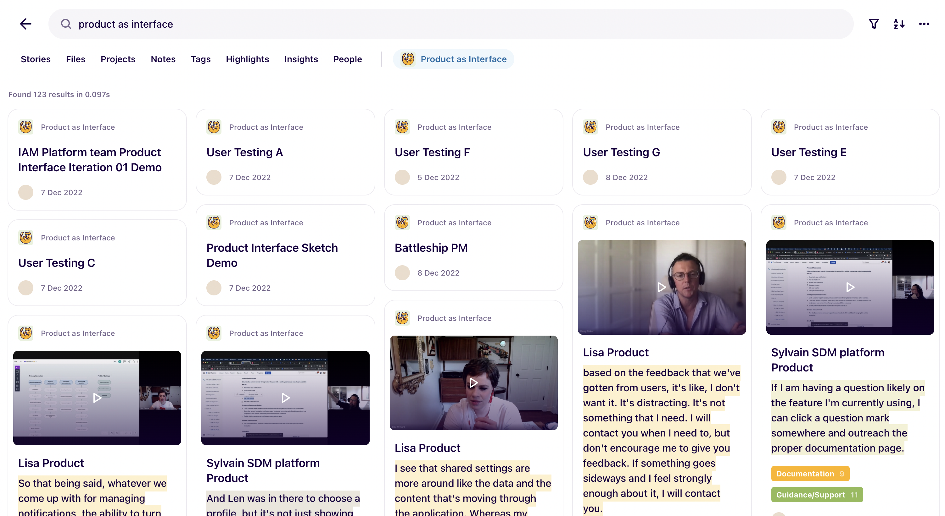
As the SDA platform expanded across CI, CD, Feature Management, and Analytics, the global navigation layer had accumulated four disconnected affordances — search, notifications, help, and profile — each built independently with no shared design language. New users had no in-product guidance; help and docs lived outside the product entirely. Working with the IAM and SaaS Foundation team, I defined a Product-Led Interface initiative: treat the header as an active system that reduces context switching and guides users toward successful onboarding. Research across the organisation surfaced nine themes — search as navigation, contextual intelligence, notification control, guide the user — which became the design brief. The work scoped four surfaces, each with a quick-access panel and a full normalised page, all sharing the same list/detail template pattern established by the wider UI architecture work.
001002
Typeahead, results panel, and full search page
02 Search as Navigation
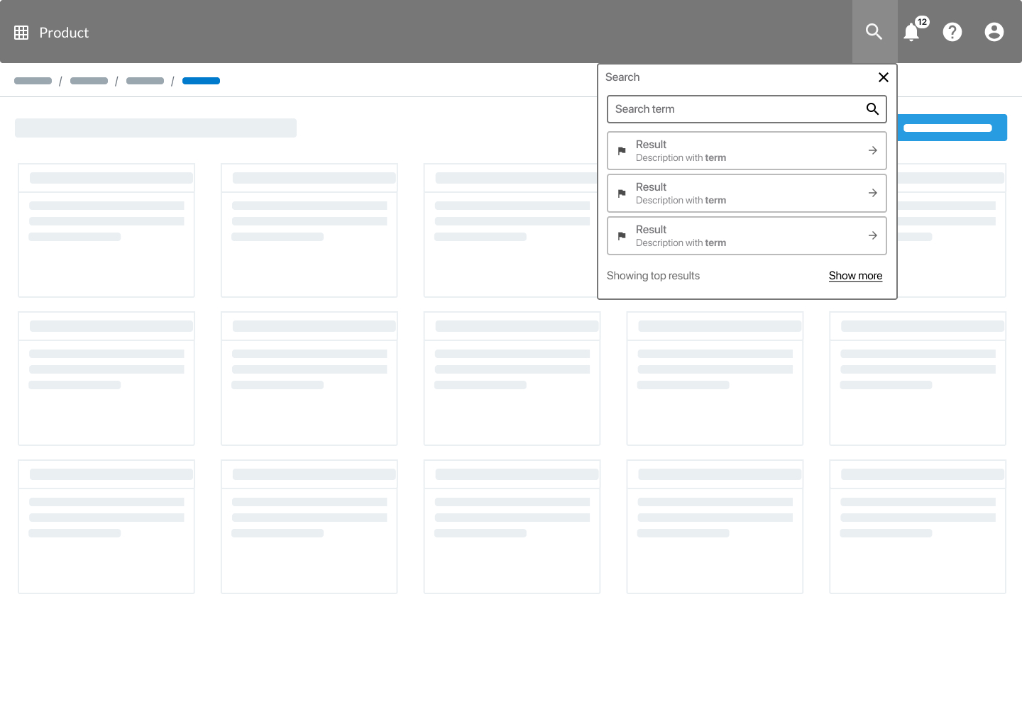
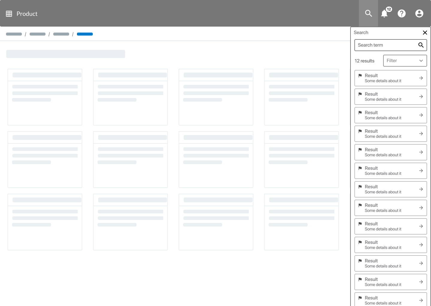
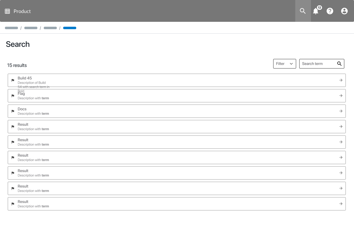
Search opens as a lightweight typeahead — top results appear beneath the field as the user types, with a show more link to expand without navigating away. The full results drawer slides in from the right, keeping the current page visible while surfacing a filterable list. When the complete result set is needed, search promotes to its own dedicated page — using the same normalised list template shared across all PLI surfaces.
003004005
Grouped panel and full notification centre
03 Notifications
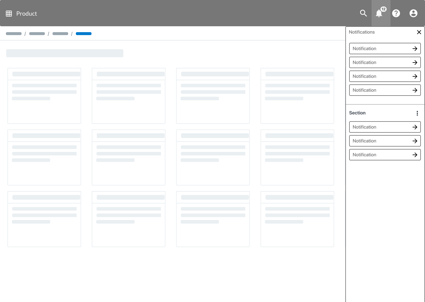
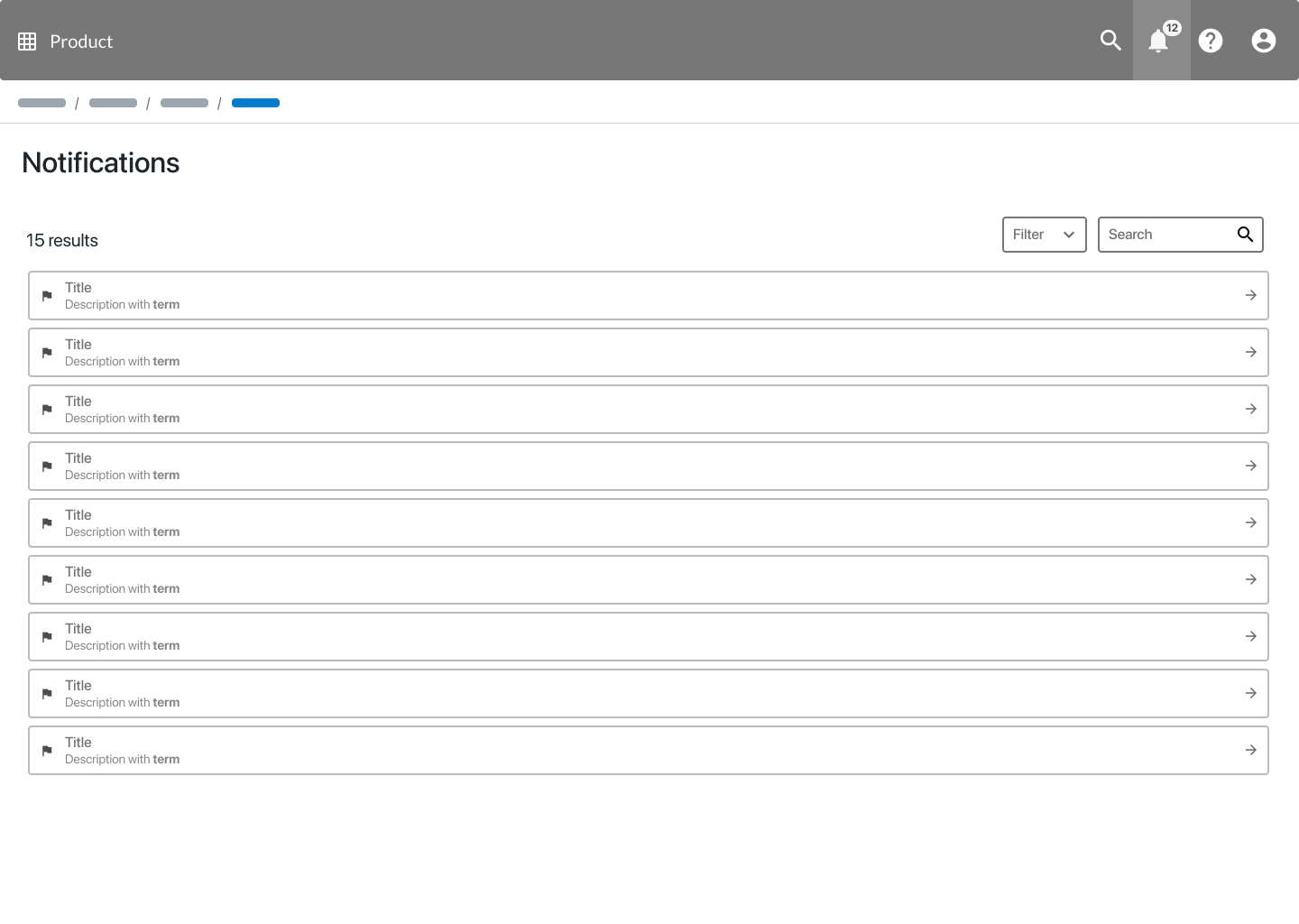
Tapping the bell opens a grouped notification panel in the right drawer, categorised by section for quick scanning without leaving the current page. When users need to manage their full history, the same content expands into a dedicated Notifications page — searchable and filterable, using the same list template as search results. The pattern holds throughout: quick access in context, full page when needed.
006007
Contextual guidance without leaving the product
04 Help & Docs
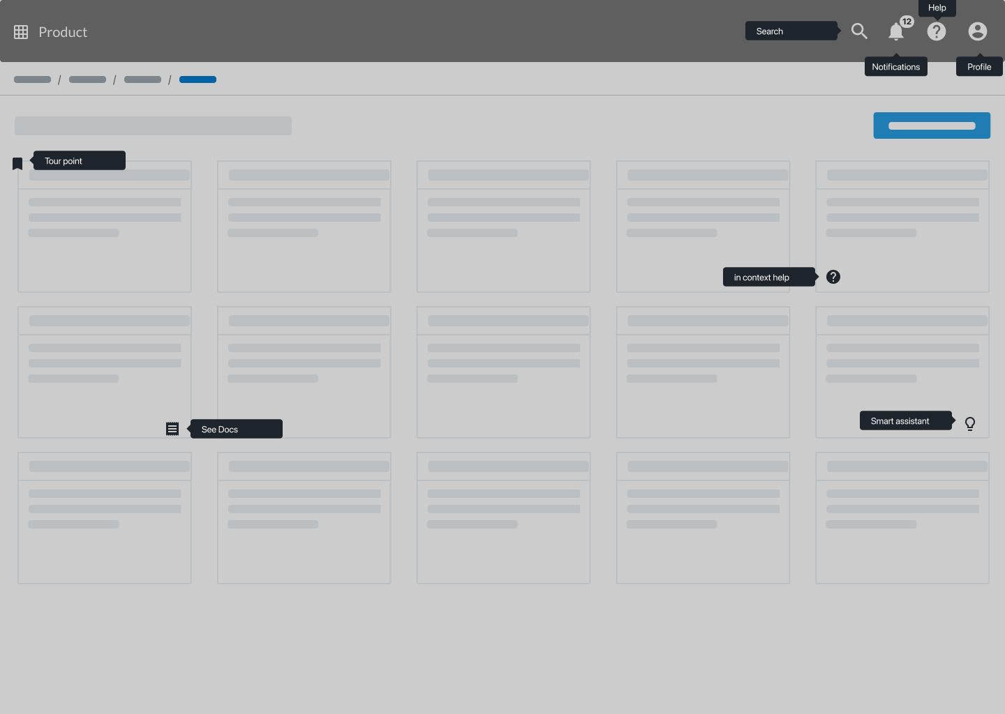
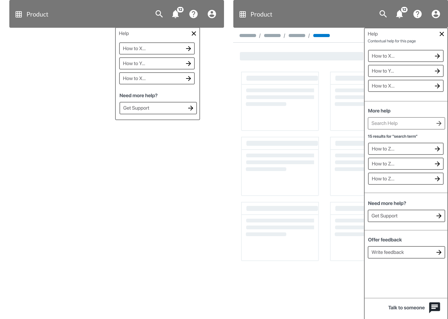
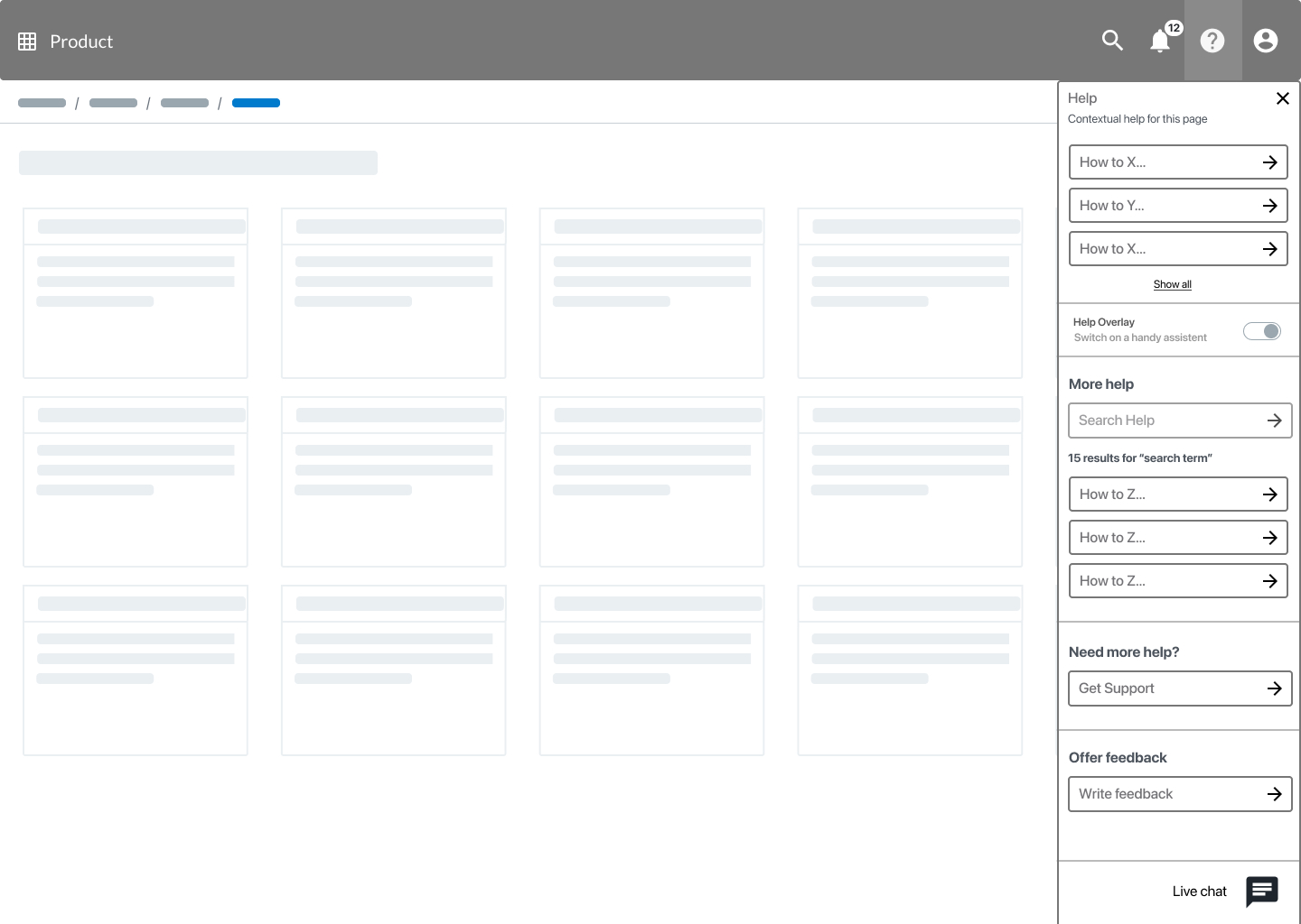
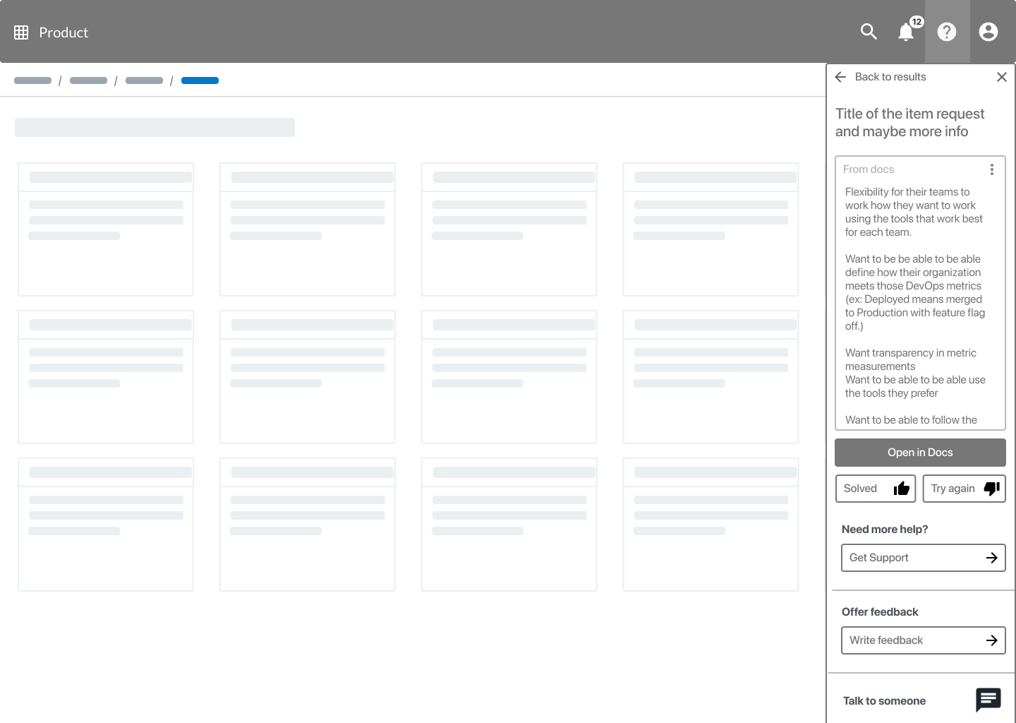
Help is always reachable from the header but becomes page-aware — the panel surfaces how-to links relevant to wherever the user currently is, before offering search, get support, and live chat as escalation paths. An optional Help Overlay toggle activates inline tour points and in-context prompts directly on the page. When a result is selected, the doc content renders inline in the panel — readable without opening a new tab — with Solved / Try again feedback to close the loop and route unsatisfied users to support.
008009010
One panel to control all four surfaces
05 User Preferences
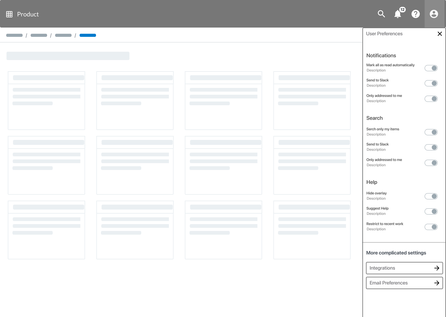
All four surfaces are configurable from a single User Preferences panel — notification routing (auto-read, Slack forwarding, mention filtering), search scope, and help behaviour (overlay on/off, contextual suggestions, restrict to recent work). Integrations and email preferences are accessible from the same panel without burying users in settings pages.