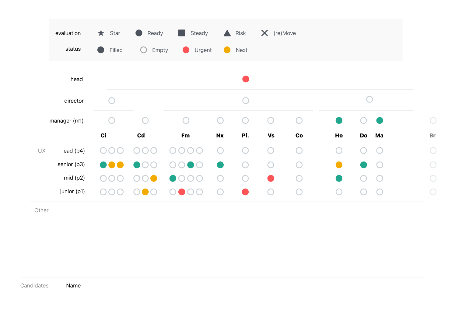
Unify — SaaS Platform Design
Head of Design — platform-wide UX strategy, navigation architecture, and design system; leading a team of seven
Unify was a greenfield platform inheriting the technical and design debt of products built independently. The navigation needed to hold every CloudBees product in a single, coherent model. UI patterns had diverged across product lines. And the design team — now seven people — needed a shared foundation to work from, not seven parallel interpretations of the same platform.
Led the platform-wide IA effort through four iterations of navigation architecture, converging on a modular v4 model. Standardised the high-frequency UI patterns — settings surfaces, summary tabs, entity CRUD navigation. Embedded designers into the component dashboard and key feature areas as strategic partners.
Head of Design — seven designers, one platform
Information architecture & flows
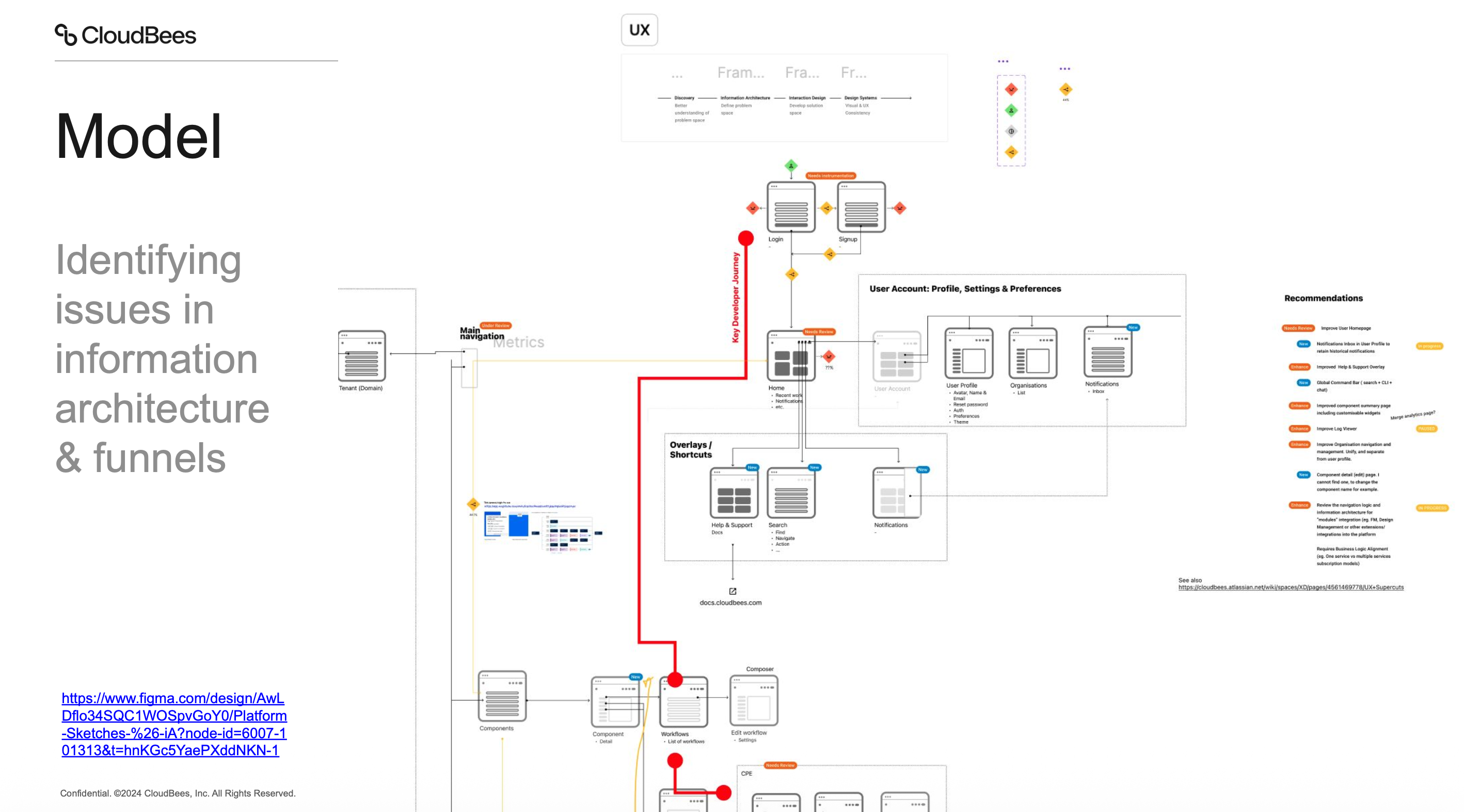
Navigation v4 updates — overview of the v4 navigation system
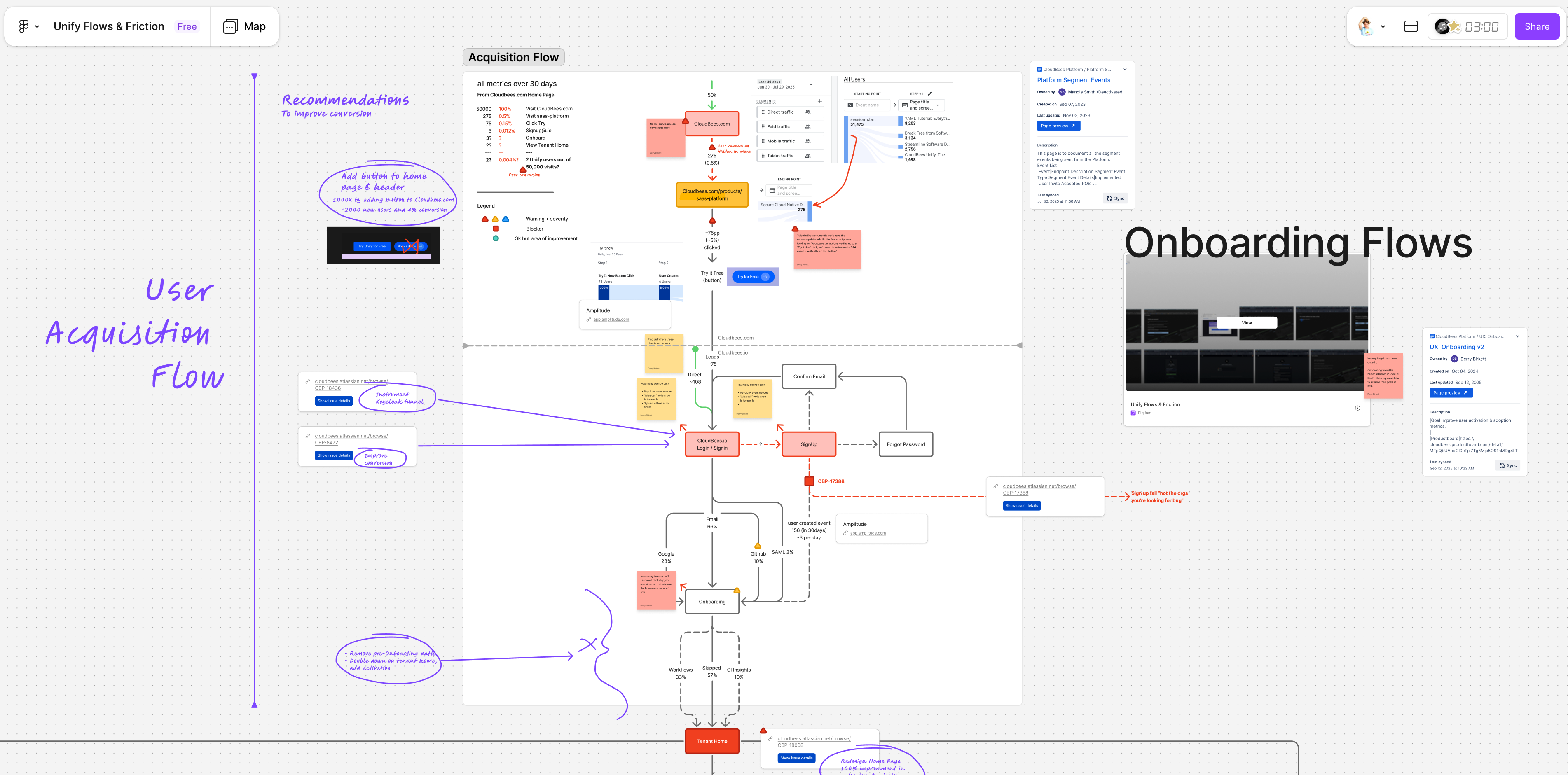
CloudBees customers operated across multiple organisations and tenants. The existing navigation had no structured switching mechanism — changing org required navigating back to a top-level view and reorienting, losing the current context.
A drill-down navigation menu with hierarchical org switching, inline search, and persistent context — users drill into an org and remain within it as they navigate the platform, without being reset to a top-level view.
Navigation v4: Nav Groupings — product area clustering and hierarchy
A flat navigation list that grows with each integrated product becomes unreadable. Users lose the ability to locate items quickly or understand the platform's structural model from the sidebar — requiring them to already know where everything is before they can find it.
Grouped navigation by semantic category (entities, runs/workflows, apps) — making the platform's model legible from the sidebar without requiring users to already know the product structure, and creating a foundation that scales as new products are added.
Navigation v4: Sidenav + Orgs — org model integrated into platform navigation
Organisation management was scattered across the Unify platform — no clear, consistent location for accessing org-level settings, users, and permissions from the main navigation flow. Engineers had to know where to look.
Embedded org management into the sidenav with a drill-in pattern: orgs listed in the sidebar, each revealing a structured set of management views that followed the same tab pattern across every org.
Navigation v4: Settings Overlays — standardised settings surface pattern
Settings and configuration surfaces embedded within the main product layout created navigational confusion in the Unify platform — particularly across tenant, org, and user account settings, where users weren't sure whether their changes were affecting the product or the platform.
Overlay spaces for settings — a layout shift that visually separates the configuration context from the main app, with a clear return path back to the product. Applied consistently across tenant, org, and user account settings.
Navigation v4: Summary and Settings — standardised tab structure across entities
Different entity types in CloudBees products had different tab structures and inconsistent locations for settings — users had to relearn where to find configuration options for each entity type across different product areas.
A universal tab standard — Summary → [entity-specific tabs] → Settings — applied consistently across every entity in the Unify platform. Reduced the learning curve by making the structure predictable regardless of which entity an engineer was managing.
Navigation v4 CRUD Model — standardised entity navigation pattern
Different entity types in CloudBees products had different mechanisms for editing and deleting — some used inline controls, some used action menus, some used separate settings pages. Engineers had to relearn the pattern for each entity type.
A universal CRUD model applied to every main entity: Settings tab is always where you update, delete is always at the bottom of Settings — predictable, learnable, and consistent across the entire Unify platform.
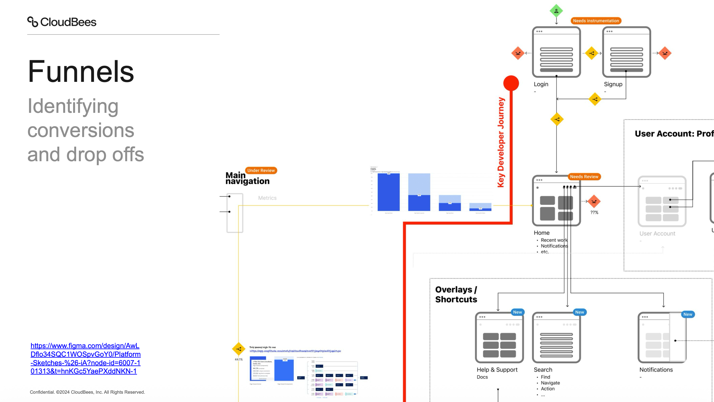
Nav v4 Universal Search — cross-platform search integration
On a platform carrying multiple CloudBees products, sidebar navigation alone creates too much distance between where an engineer is and where they need to go — particularly for power users working across many entities and product areas.
A universal search command bar with entity search, page navigation, action shortcuts, and recent places — reducing platform navigation to a keyboard shortcut for experienced users and giving everyone a faster path across the platform.
Navigation upgrades — from CDRO to the Unify platform navigation model
The Unify platform needed to surface multiple products to users at different subscription tiers without confusing users who signed in via one product with capabilities they hadn't purchased — or hiding those capabilities entirely.
A modular activation flow with contextual marketing pages, configurable billing limits (soft and hard), and a clear upgrade path — allowing users to discover adjacent platform capabilities and activate them without friction or confusion.
Modular Navigation v4 — platform navigation architecture demo
A multi-product SaaS platform with tiered subscriptions needs navigation that distinguishes purchased products from available-but-unpurchased ones — without creating confusion, dead ends, or giving the impression of broken features.
A modular navigation architecture where disabled items are visible but clearly marked with an 'activate' state — routing users through a marketing page and billing step before granting full navigation access, with the nav updating dynamically after activation.
Retry button microinteraction — UI detail and loading state animation
State changes (retry, success, failure) in dense enterprise UIs are easy to miss — especially when they happen inline without navigation or modal interruption. Engineers need clear confirmation that an action worked without being pulled away from their task.
A subtle inline microinteraction for retry/succeed states — visible feedback that confirms the action completed without pulling focus from the main content.
Onboarding
Onboarding V2 Sketches — structured onboarding flow for the Unify platform
Enterprise DevOps platforms have a well-known time-to-value problem: new users sign up, encounter an empty state, and churn before they reach the moment that would have convinced them the product was worth the effort.
A PLG onboarding model that uses the sign-in step to connect a repo or template, bootstraps pipeline infrastructure automatically in the background, and surfaces real pipeline data (component health, security scan results, deployment status) before the engineer finishes their first session.
DevOps Agentic Onboarder — AI-guided onboarding adapting to user role and context
Enterprise DevOps platforms require significant configuration before they deliver value — integrating tools, connecting repos, configuring plugins. New users churn during setup because the payoff is too far away and the configuration burden is too high.
An AI-powered onboarding agent that does the setup work for the user — scanning the repo, detecting the stack, recommending and activating the right integrations, and surfacing actionable insights immediately. Reduced time to value from one week to 30 minutes.
Dashboards
Component dashboard discovery — live session mapping the feature problem space
The component summary page needed to surface meaningful health signals for every team regardless of their level of CloudBees integration — but dashboard designs typically fail at the edges, either too opinionated to work without full integration or too generic to be useful with partial data.
Designed a component health model that works at every integration level: show what's available, gray out what's not activated with an activation prompt, and guide users toward richer data without requiring complete platform compliance first. Established a branch-level health view and the foundation for a persona-based widget customisation model.
Component Summary Page v2 — refined dashboard with updated hierarchy and layout
The initial component summary page treated all users the same — but a developer's concerns (test health, code quality) and a DevOps or SRE engineer's concerns (deployment frequency, workflow stability, environment versions) are structurally different and require different information hierarchies.
Introduced persona-based widget workspace suggestions — the dashboard initialises from a role-appropriate default, with full rearrangement and card density customisation available on top. Separated health categories into distinct sections so each type of signal is navigable independently.